Impact of Diversity at MIT: Step Up to the Board

Link to our final project here: Today’s Lecture: Gender Disparity at MIT

Team Members: Kenneth Friedman, Phillip Graham, and Andrew Mikofalvy

After reading through report on The Status of Undergraduate Women at MIT we wanted to share the findings and thereby increase awareness of the problem of gender inequality on campus, and show that the Institute is listening and able to feasibly implement the reports recommendations to help fix these issues. 

Our audience for the final project is the MIT community. Presumably most students hadn’t heard of, or at least read through, the report on The Status of Undergraduate Women at MIT which we feel is helpful in understanding the diversity problem on campus and what MIT can do to solve them.

To gauge the reaction of our intended audience, we created a pre- and post-survey that asked for the user to rate on a scale from 1 to 5, from Strongly Disagree to Strongly Agree, the following two statements:
There is a gender inequality problem at MIT.
Assuming there is a diversity problem at MIT, there are many feasible approaches to solving it.
We feel that these two statements best illustrate the goals of our project as we want our audience to be more aware of gender inequality on campus, through the findings of the report, and to be informed of the recommendations the report found for MIT to solve these issues.

From the pre- and post-surveys we found most of our audience went from disagreeing that gender inequality is an issue on campus to strongly agreeing after going through our final project. Our second question, which discussed the feasibility of solutions to these problems showed an even larger increase in agreement as most our pre-survey responses were strongly disagreeing to agreeing.

We also got incredibly helpful feedback on wording and questions to use by our peers/audience and really appreciated the help.

Methodology for Diversity at MIT: Step Up to the Board

Link to our final project here: Today’s Lecture: Gender Disparity at MIT

Team Members: Kenneth Friedman, Phillip Graham, and Andrew Mikofalvy

How we found our data:

Our group was interested in finding a dataset that related to education and academia. We decided to focus on MIT and found two reports that interested us:
A Study on the Status of Women Faculty in Science at MIT – Written in 1999
Which discussed the lack of women faculty in the Department of Science at the time (Around 8% for 10-20 years), gender discrimination with space, resources, equipment, and more, and the actions the Dean of MIT took to address these issues.
The Status of Undergraduate Women at MIT – Released by Caroline Chin and Kamilla Tekiela in February of 2016
Which discusses in great detail data collected through several surveys conducted by the MIT Office of Institutional Research, several campus focus groups, and the support of many more, which showed gender discrimination on campus today and recommendations to fix these issues moving forward.

How we cleaned it:

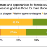
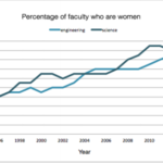
Data in The Status of Undergraduate Women at MIT report took the form of tables of questions from surveys and their resulting responses, graphs, and charts (one of which we had to extrapolate our data from).
For example:

How we analyzed it:

We analyzed the data by comparing survey answers between men and women looking for significant differences in responses, and compared a graph that shows the percentage of women faculty and undergraduate women over the past decade to the actual 50% of the population being women.

How we synthesized it into a story:

After reading through the 70 page report, our group decided to create an interactive exploration of the data in the report to show the issues associated with the lack of diversity on campus and gender discrimination.
The report on Undergraduate Women at MIT separates the findings into 3 categories:
Academics and Leadership, Environment, and Confidence and Stress.
We decided to have our audience answer three questions in the form of interactive visuals, by using one question and result from each category. We chose one from each category to show the breadth of gender inequality covered in the report.
This design decision was inspired by You Draw It by The New York Times to allow our audience to use their best judgement to guess at what the results of the survey showed. Then the user is shown the results of said survey so that the audience can compare their answer.
After seeing the each result, a corresponding recommendation is shown on what MIT can do to help solve the issue in the question.
For example, closer relationships with advisors can be advisor/advisee dinners hosted by the department.
Our story closes with our Call to Action being, we invite the audience to write a note to MIT’s new Vice President for Student Life, Suzy Nelson, discussing gender discrimination the audience may have either noticed previously or become aware of due to our project, and suggest her to look into the recommendations in the report on Undergraduate Women at MIT.
Another design decision we made was to use the Blackboard as the basis for our interactive visual. The academic tone it sets, alongside the title, is supposed to feel like an interactive lecture, similar to solving problems in MIT classes that are TEAL (Technology Enabled Active Learning) where students are writing on boards to solve problems during lecture. We wanted our audience to feel like they are participating in solving these issues on campus.

Gender Disparity at MIT

Donate by Playing – A Fundraising Board Game for the International Federation of Red Cross and Red Crescent Societies

Group Members: Argyro Nicolaou, Reem Alfaiz, Phillip Graham, Gary Burnett

The data say that there are many people immigrating to Europe. In 2015 alone, more than 1 million people arrived to Europe by sea. The numbers are increasing every year. In the first 3 months of 2016 the number of sea arrivals was 6 times greater, than the same time in the previous year. This influx of refugees will put a lot of stress on relief organizations, as they will now be even more limited in the number of resources they have available.

The goal of our project is to increase funding for these organizations via a game. Our audience are donors attending a fundraising event for the International Federation of Red Cross and Red Crescent Societies. These people are at the benefit because they want to donate and have some level of investment in the cause. Our goal is to encourage the attendees to donate by eliciting an emotional response via game play. Our game puts them in the position of refugees and shows them how the money they donate to IRFC will directly impact the lives of people trying to immigrate to Germany.

We want to tell this story to highlight the impact that relief aid can have on the life of a refugee. The journey to asylum can be painful and exhausting. Often times it leads to separation from one’s family, and sometimes it can even lead to death. We want to show that this is not how it has to be. There are organizations out there that provide relief and make the lives of refugees more bearable, and donating to organizations such as IRFC can have a direct impact on the lives of real people.  

One of the most powerful data sources we used for our project were personal stories found online, that were documented by real life refugees. This helped a lot in the creation of our characters and what sorts of events can occur during an immigration across Europe. These personal stories both contribute to the accuracy of the journey and also help the players sympathize with situation and feel an emotional connection to the player.

Another useful data source was the UNHCR database of the popularity of various routes across Europe. These helped with the design of the gameboard. There are many paths the players could traverse, however we only decided to include those that were actually feasible. To achieve this we removed routes that included borders that were closed. We also chose to only include paths that many people have travelled across according to the dataset, as opposed to less popular options.

The rules of the game are simple. You are a refugee from Syria trying to get to Germany. Along the way you encounter various obstacles but also different kinds of help. Each player will be assigned a character. The characters are: Malika – a 26-year-old nurse from Aleppo, Adnan – a 10-year old boy from Latakia, Youssef – a 30-year-old man from Homs and the Alsouki family – a family of 4 from Damascus

All players start with 10 stamina points. You draw a card at every location, starting from the common starting point that is Syria. The card has 2 kinds of information on it: it tells you where to go next, and it also tells you how each transition affects your stamina points.  Some cards give the player the option to purchase stamina points. These real-life donations all go towards the IFRC fundraising effort to help the national Red Cross and Red Crescent societies in Europe to deal with the unprecedented number of refugees and migrants arriving from the Middle East and Africa.

We want the players to empathize with the obstacles and the hardship that migration involves.

We want people to encounter obstacles in the game that will motivate them to donate small amounts of money that can make a big difference.

We did not want to create a competitive game – buying stamina points benefits everyone on the table, so to speak.

Below are Dropbox links to the pdfs of cards we used for the game:
First Half of Cards
Second Half of Cards

Also, the PDF of Game Board

Playing Game Example Donate By Playing Game Board

Phillip Graham’s Data Log – 2/7/16

Data created by me for the day. (To the best of my knowledge)

  • Guest Swipe on a BU Student’s Meal Plan for Breakfast: A guest swipe was used up by my friend which is stored on their system
  • Paid the fare/Swiped onto the T at Kenmore: Fare was deducted from my charlie card
  • Used my student ID to swipe myself in as a guest to Burton Conner
  • Made a purchase with a credit card at La Verdes Convenience Store
    • Data from card, and for internal store purchase
  • Watched the Super Bowl on our TV: viewership data
  • General phone data created from:
    • Snapchat
    • Facebook messenger – sending messages
    • Phone call
    • Sent emails from phone and text messages
    • Tinder
  • Accepted an invitation to an event on Facebook

CDC’s Women and Risks of Drinking Poster

The Centers for Disease Control and Prevention released an Infographic on the risks of drinking for women last Tuesday as part of their Vital Signs Report. The data displays the risks of drinking alcohol when pregnant. The data also claims that drinking 8 drinks a week, or binge drinking can lead to injuries/violence, STDs, and unintended pregnancies for women, among many other risks, without discussing any other contributing influences.

The audience is doctors, nurses, and other health professionals as the lower half of the poster shows a 5-step guide for helping women avoid drinking too much.

The goals are to show women (or their health professional who will pass on the information) that drinking holds many risks during pregnancy and the general risks of drinking, although the risks are not attributed to anything except for drinking which is absurd.

A small portion of the data displayed effectively shows the risks of drinking while pregnant, which seems to be the main message of the poster. A quote supporting this is on the lower half of the poster that suggests that women trying to get pregnant should avoid drinking alcohol. The biggest problem is half of the data shown on the top half of the poster does not suggest women who are trying to get pregnant should drink less, which is legitimate considering the risks shown when a women becomes pregnant. The poster instead suggests that women use birth control when drinking, insinuating that because women can have children; they are to be held accountable for the risks of drinking, which is why this poster has become so controversial.


Top Half of CDC Poster on Women and Risks of Drinking

Poster Link

Original CDC Article Link